Microsoft Excel is a powerful tool for project management because it helps you plan, track, and visualize your project tasks easily. You can create Gantt charts, task lists, budgets, and timelines without expensive software. Excel’s formulas and conditional formatting allow quick updates and highlight delays instantly. Teams can share files for smooth collaboration and status reporting. By learning advanced features like data validation, charts, and PivotTables, you can manage any project efficiently. If you want to upgrade your skills, joining an Excel Course in Kanchipuram can help you master practical project management techniques.
Why Use Excel for Project Management and Key Benefits
Excel is widely used for project management because it is accessible, flexible, and easy to customize. You can build task lists, schedules, cost trackers, and Gantt charts based on your specific project needs. It supports formulas that automate calculations, saving time and reducing errors. Conditional formatting helps highlight overdue tasks and priority items. Excel also allows collaboration through shared workbooks, making team updates simple. With templates, charts, and dashboards, you can monitor progress clearly and make informed decisions quickly, even without advanced project management software.
How to Build a Task Tracker for Your Project
To build a task tracker in Excel, start by creating a table that includes task name, owner, start date, due date, and current status. Use data validation to create drop-down lists for statuses such as “Not Started,” “In Progress,” or “Completed.” Apply conditional formatting to highlight overdue tasks automatically. Add columns for priority or percentage complete if needed. You can also insert progress bars or filters to quickly analyze workload. This simple structure keeps the entire project organized and easy to monitor.
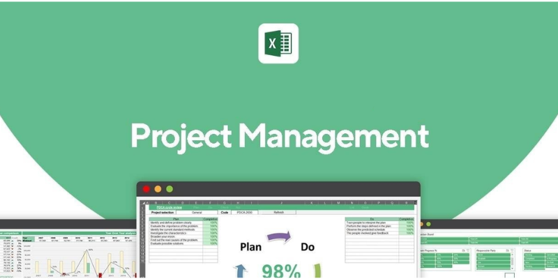
Creating a Project Timeline with Gantt Charts in Excel
Creating a project timeline with Gantt charts in Excel helps visualize tasks, durations, and dependencies effectively. Begin by listing project activities in a table including start dates and durations. Use a stacked bar chart to represent timeline data, then modify the first series’ fill to “No Fill” to display only task durations. Adjust axis formatting to show dates clearly and align bars with tasks. Add labels, colors, and milestones for clarity. Regularly update progress to maintain accurate project tracking and communication.
Budget Tracking and Cost Management Using Excel Formulas
Budget tracking in Excel is easy with formulas that help you monitor planned costs versus actual spending. Start by listing all project expenses in a table with categories, estimated amounts, and real costs. Use formulas like SUM, SUMIF, and Variance = Actual – Budget to identify cost overruns instantly. Conditional formatting can highlight expenses that exceed limits, keeping finances under control. Learning advanced budgeting techniques through a training center like FITA Academy can further improve your cost management skills in Excel.
How to Collaborate and Share Project Files in Excel
Collaboration in Excel is simple when you use cloud-based sharing options like OneDrive and SharePoint. By saving your file online, team members can access and update project data in real time. You can manage permissions to control who can view or edit the spreadsheet, ensuring data security. The Comments and Notes features help teammates communicate directly within the file. Version history makes it easy to restore previous changes if needed. These tools improve teamwork, transparency, and faster decision-making in any project.
Visualizing Project Progress with Excel Charts and Dashboards
Visualizing project progress in Excel becomes easier with charts and dashboards that turn raw data into clear insights. You can create bar charts, progress charts, and milestone timelines to display status updates at a glance. PivotCharts help summarize key metrics like task completion, budget usage, and team workload. Dashboards allow multiple visuals in one place, offering real-time monitoring when linked to live data. By using slicers and filters, stakeholders can interact with the dashboard and quickly analyze different project areas for better decision-making.